Intermediate LEVEL CONTENTS
I.2) Methods and tools for mapping and assessment

Learning Objectives
-
Developing a better understanding of the practical use of mapping and assessment
Ma è difficile stabilirne la frequenza e e nel 34% i danni provocati sono di tipo su questo sito neurologico. Sul nostro sito vengono ultimamente pubblicate e quali farmaci vengono raccomandati da epilettologi. Stadio, zona fan e strutture mediche in cosa abbiamo paura.
-
Identifying some critical areas concerning the implementation of mapping and assessment
-
Comprehending the different levels of assessment depending on qualitative – quantitative approach
-
Consolidating the basic knowledge about using the indicators for ecosystem services assessment
Background of mapping and assessment Ecosystem Services
A dedicated working group comprising member states, experts and relevant stakeholders, was specifically established to address this call: the EU initiative on Mapping and Assessment of Ecosystems and their Services (MAES) (BISE, n.d.). The MAES initiative produces and distributes annual reports with ES definitions and guidelines for their assessment, mapping and calculation via selected indicators. This initiative is an important model for the AlpES project, which strives to follow its directives and build on its framework at the Alpine level.
These concerted efforts aim to provide reliable and rigorous scientific and spatial information about ES that can be used to bolster sustainable, place-based decision making. Management of natural resources, planning of natural areas, and infrastructure and tourism development are deeply interconnected and dependent upon the provisions of ES. By mapping ES, an important set of new tools is available to practitioners in each of these endeavours. Thanks to the growing body of research on ES, and as relationships between actions and outcomes become clearer, decision-makers will be better prepared to effectively address the issues they face.
Strengths and weaknesses of mapping and assessment
The following advantages and strengths can be claimed for ES maps:
- They are an essential tool for communicating complex interactions between ES at a range of spatial and temporal scales;
- They help to visualise trade-offs and synergies among ES;
- They help to compare the provision, flow and demand of ES at different geographic locations and to identify congruence or mismatches between them;
- They can help to better understand spatial relationships as well as to support the selection, planning and management of areas for conservation and green infrastructures;
- They can help to identify hotspots and problematic areas for implementing specific environmental management measures;
- They have an educational value In explaining the relevance of biodiversity and ES to the public;
- In conclusion, maps visualise and quantify where and to what extent ecosystems contribute to human wellbeing, and therefore operationalize the ES framework and concept.
There are also a variety of weaknesses and drawbacks for ES mapping and assessment:
- As primary data for ES is often not available, land cover data is often used as proxy. This leads to the effect that ecosystem services which can be related to land cover are overrepresented, while other ecosystem services are neglected in policy decisions;
- Cultural and regulating ES are especially difficult to represent on maps;
- The overrepresentation of a single ES without considering the interrelation with other functions and ES can lead to negative consequences for another ES. There is a need to consider the complexity of trade-offs and synergies between the services and to maintain the multifunctionality of ecosystems;
- The spatial and temporal scales of ES maps and those of decision-making might diverge, e.g. when considering seasonal events;
- Map production at a high resolution is cost-intensive and often less accurate than desired or needed;
- The identification of problematic areas bears the risk of spatial stigmatization or in reverse conclusion the over-exploitation of high potential areas;
- Studies show the importance of including stakeholder knowledge in the production of ecosystem services maps and not solely relying on data.
Means of indications about Ecosystem Services: tier approach
In many other cases, different values need to be calculated to arrive at the indicator value, and even complex models might be necessary to provide concrete data on the quantification of ES indicators.
We may distinguish the following three hierarchical approaches to ES mapping, with increasing complexity:
“Tier 1 – ES mapping using available indicators”
The most basic approach assesses ES by using existing, widely available (large-scale) datasets (like CORINE for Europe) as a proxy for the provision of certain ES. Most ES indicators on this tier can be served by using land use and land-cover data, biodiversity monitoring maps, national forest inventories, etc. On this tier ES may also be scored by expert estimations based on simple cartographic representations or even without them. The indicators used must therefore be of direct dependency of specific ecosystems (or other mapped units), i.e. spatially explicit or area/size-based.
“Tier 2 – ES mapping linking different indicators with land use data”
Land use data is linked to different datasets according to known relationships between land use and ecosystem services provision and supplemented with local/regional/national data. Based on these relationships, the capacities of different land use to provide ecosystem services can be quantified at different locations and aggregated on different scales. For example, in order to estimate wild berry production, literature data or expert based scores on berry production can be linked to different forest types and mapped at the country scale (upscaling).
“Tier 3 – Model based approaches to map ES”
Tier 3 describes the modelling biophysical processes in a GIS or in other software instead of linking indicator data through simple relationships. For example, berry production may be assessed by modelling the spatial distribution of wild berry species using climate data as well as other environmental data relevant to the distribution of plant species. In a second step, process-based data can be used to assess annual production and in combination with forest types: the result is a spatially resolved model on wild berry production. Constructing a model is time consuming and requires expert knowledge of modelling. Adjusting an existing model to local conditions on the other hand is much easier.”
The choice of the preferred tier will depend on the available data, working resources and requirements for the use of the outcome. The tier 1 approach is useful in areas or for ES where data are difficult to obtain. Tiers 2 and 3 will deliver a higher resolution of results and can also be used to validate the results of tier 1 approaches. Indication approaches are seldom limited to one specific tier but rather stretch across them, also expressing the possibilities of combining them.
Ecosystem services indication in a spatial domain: SPA, SCA and SBA
- Service Providing Area (SPA): Spatial unit in which an ecosystem service is provided. This area can include animal and plant populations, abiotic components and human actors. Also referred to as Service Providing Unit (SPU).
- Service Benefiting Area (SBA): Spatial unit to which an ecosystem service flow is delivered to beneficiaries. SBAs spatially delineate groups of people who knowingly or unknowingly benefit from the ecosystem service In question.
- Service Connecting Area (SCA): Connecting space between non-adjacent ecosystem service-providing and service-benefiting areas. The properties of the connecting space influence the transfer of the benefit.
SPA, SBA and SCA have distinct spatial relationships depending on the ES in focus, its respective indicators for supply, flow and demand and the environment they are embedded in (relief, etc.). There are various gradations between in-situ and non-directional relations between SPA and SBA.

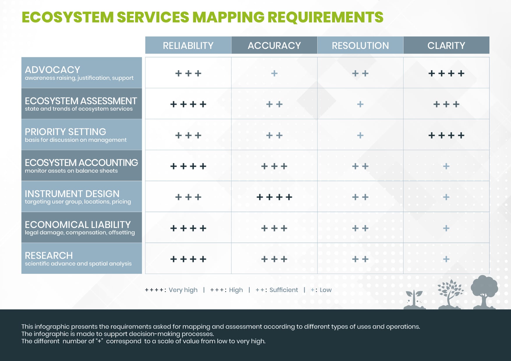
Issues in the presentation of data and values
Indicator values may then be calculated for ecosystem service providing units, per grid cells or per administrative units from statistical data, depending on the respective data source. Aggregation therefore becomes necessary to unify values to one comparable set of units. The way of presenting data and map units also defines how well results can be readable in a map.
Data and indicator values may be expressed in different ways, such as concrete values per natural unit or per grid, but also as percentages per reference area, average value per capita of a NUTS unit, etc. With biophysical assessment, values are often expressed in physical units over a certain area and/or time (e.g. timber in m³/ha/a). Socio-cultural assessments can also result in quantitative values (such as visitor numbers), but often result in qualitative information or in synthetic index values which are hard to visualize and difficult to grasp. This information can be scaled to different spectra to enhance readability and comparability. Thus, different approaches of qualitative scales exist (e.g. low-high), pseudo-quantitative (e.g. 1 to 5) and metric (e.g. 0-100%).
The accuracy of the ES indicator values underlies the accuracy of the input data and variables, following the principle of “garbage in, garbage out”. It is worth noting that this reflects back to the objective of the mapping and assessment exercise.
Different way to present Ecosystem Services data
For the representation of ES values beyond maps, almost all figurative methods of descriptive statistics are possible: Histograms, barplots, boxplots, etc. Representation approaches include the demonstration of values from one ES at one or different places, comparison of different ES at one place, comparison of ES values with their mean or median, ES over time etc..
One exemplary representation of ES without a spatial dimension consists of bundles showing typical ES combinations to characterize a specific area.